
An app to help find and make friend by filtering mutual interests.
How through the use of Human Centered Design, I attempted to create a solution for those looking to find friends and build their social circle.
Project Details
Roles
Researcher, UX/UI Designer, Copywriter Timeline
10 weeksFigma, Google, Unsplash, Otter.ai, pencil, paper, Tools
Constraints
TimeProblem Space

I have often noticed that new residents in Vancouver can often feel alone and isolated due to a lack of social networks or support, thus causing an uphill battle in adapting to their new surroundings. The 25 to 35 year old age group is hit hardest by this, as they are relocating most frequently for work or study.
On a personal level, I have experienced this too. It goes without saying, that not everyone experiences these issues, but enough people do that this city has a well established reputation. What follows is my attempt to find a doable solution, not just in Vancouver, but for anyone who struggles to connect with others.
Market Research
To begin understanding the problem I conducted secondary research, examining Vancouver’s population, how they have responded to surveys on the issue, as well as the broader effects of loneliness and social isolation. Some key findings were
of people say it’s difficult to make new friends in Vancouver
31%
25%
Vancouverites deal with social isolation
Approximately three out of ten expats surveyed, surveyed say Vancouverites are “unfriendly”
29%
18%
of cases of depression can be directly attributed to loneliness.
People with weak social connections have as much as a 50% greater risk of early death. (equal to 15 cigarettes daily)
50%
39%
of expats surveyed are unsatisfied with their social life in Vancouver.
Assumptions
Based on this research, I believe that..
It’s difficult for new people in Vancouver to make deep connections.
As there’s already a variety of existing digital solutions, which will make breaking into the market an uphill challenge.
Some people socialize within existing spheres, such as coworkers or classmates
people have a negative impression of Vancouverites due to this perceived coldness

Hypothesis Statement
I believe that if there can be a digital solution to help adults aged 25-35 reach out of their personal shells, then individuals can feel empowered to meet new people in the city and build new social circles to improve and maintain a high quality of mental well being.

Interviews

Based off my research findings, I created a script for interviews for primary research. Three interviews were conducted, all in person.
Criteria:
Participants were selected based on the following
They were in the age range of 25-35
They were living in Vancouver for no more than five years
They moved to Vancouver as adults.
Ages 25-35 has the highest demographic of people relocating to Vancouver, and are the highest hit demographic in the problem space. In terms of time in the area, I wanted people who’s experience was at most 5 years so their experiences would be fresher to mind. They needed to move here as adults.
Key Insights
After sorting interview findings into pain points, goals and motivations, they were further categorized by themes of Culture, Interaction, and Personality via an affinity map. I then created insight statements based on those themes.

Culture:
The cultural barrier for people new to Vancouver creates a divide and furthers alienation. This increased form of alienation is strengthened when the individual has to deal with a language barrier as well.
Interaction:
The depth of social interactions can often feel shallow. It is not that the people here are mean or inherently ill-willed. However individuals often find a lack of depth when meeting people in Vancouver.
Personality:
Isolation is stronger in those who self identify as being introverted. Insecurities can also be heightened when they are unsure of themselves or how to reach out to strangers within social boundaries.

This insight was chosen as it dictates how the individual interacts with others as well as the methods they use to out out to others. After honing in, it would influence the creation of the “How Might We”
Personality:
HOW MIGHT WE
empower adults foreign to Vancouver, aged 25-35 who have moved to the city within the last year to grow their social circle so that they will feel more comfortable integrating into the city and improve their quality of life?

Persona
I tend to think of personas as something like an RPG character to navigate the digital landscape. Allow me to introduce Richard.

Some key points of intervention found were
Stop the tedium of swiping
Allow for greater refinement of interests so users can hone in on commonality
Give users the opportunity to have a broader range of interactions when trying to meet someone digitally
User Stories
After exploring the opportunities for solutions, it was time to create a set of user stories. After sorting them according to epics of “Discoverability”, “Connection”, and “ Interactivity”, I then chose the specific epic of “discoverability was chosen as it had the best correlation to how a person would achieve their goal of finding a friend. I then crafted ten refined user stories based off of that chosen epic.

Task Flow
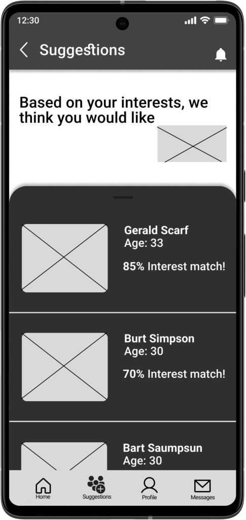
The chosen tasks were to find matches based on common interests and to find local events catered to selected interests. This would give a person a number of different ways to meet people who already have a level of commonality with them.

Sketches
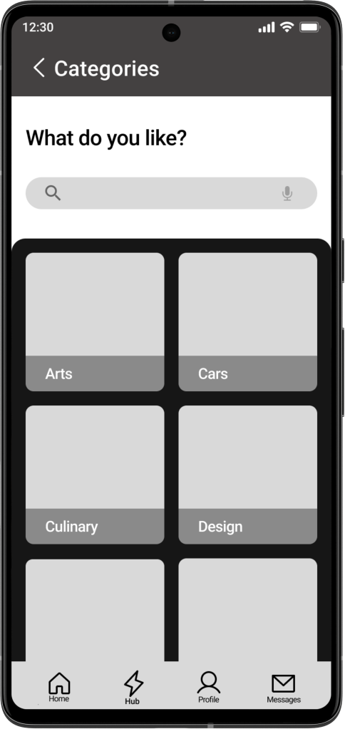
A variety of different sketches were created to better visualize the task flow. The person would first be taken to a “category” page. After selecting one such as “Sports”, they could then find others who made similar selections and then reach out.


Final Sketches
The best parts of each sketch were compiled into a final set of sketches. This would be the guide for the low-fi wire frames.

User Testing
Two rounds of testing were conducted to test the flow, design, and overall concept of the prototype. These were conducted with five testers per session.
Prototype v.1


Round 1
The first round of tests ultimately marked the first prototype as a failure. The results were fairly mixed in terms of navigability and the flow of the prototype.
The “Home” and “Hub” screens were fairly misleading, in terms of function and label.

The full test guide for the first set of user tests can be found here.
Revisions
The most notable changes were
The “hub screen was changed to “home” and became the starting point of the task flow
“Home” screen was changed to a more general “suggestions” page
The flow to seek local events was created
Screens were redesigned and given more contrast between elements.
Prototype v.2


Round 2
Navigation and flow were greatly improved. Testers had no issues finding there way through the tasks.

The full test guide for the second set of user tests can be found here.
Prototype v.3
As the issues with navigation were smoothed out in the second iteration, the third focused more on design, making the main CTA stand out more on the homepage while attempting to improve the overall visual hierarchy.


Branding
Naming and wordmarks
For names, I wanted to find something direct and to the point that would tell a person what the app does in a minimal amount of syllables. After coming up with a variety of names, I went with “Common Ground”. I then began experimenting with different ideas via sketching.

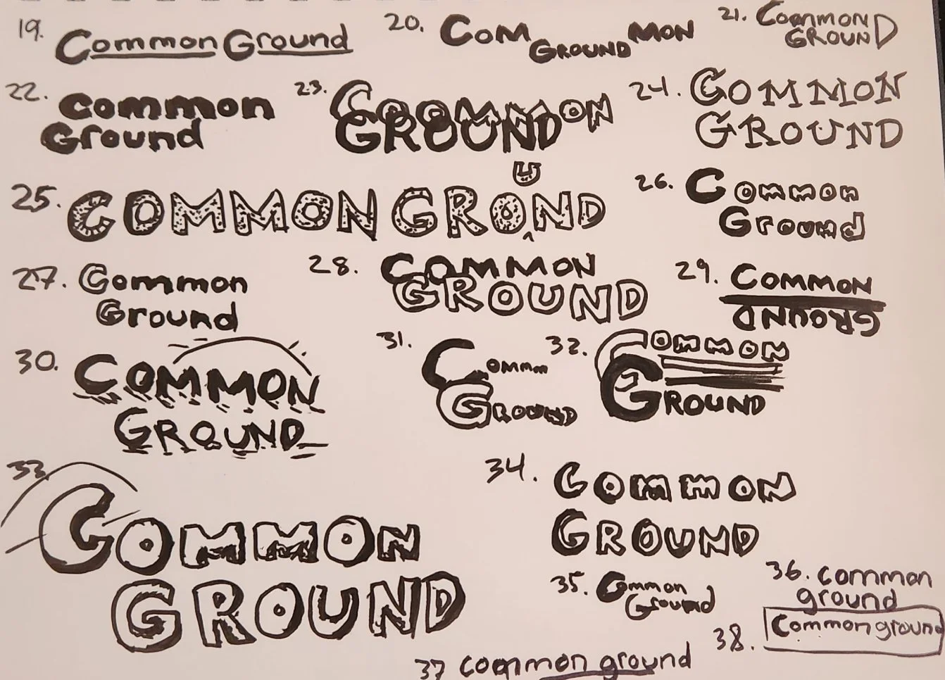
However, I realized that “Common Ground” was too long and sounded more like a coffee shop than a friend finder. I then made a slight pivot to my number two choice, “Buddy Up”. A new set of sketches was created.


Typeface
I decided on Bauhaus93 for its unique curves and it’s inviting demeanour. Unfortunately, due to time constraints, I was unable to further explore ways to make it more personalized before the deadline.

Moodboard

I utilized a mood board to better understand the vibe of the app and develop a color palette. I knew that I wanted green, as it represented growth and spring, helpful for fostering friendships. I wanted a calming blue to counter the stress of that some have when meeting new people.
Final Wordmark
I would change the name of the app for the third time to the more approachable “Be You”. As it was the same initials, the icon and color palette could remain the same.

Typography
For typography, a switch was made from Roboto, the android standard, to Matter. I felt it was more unique and offered a level of design agnosticism for the product, which would give a level of accessibility regardless of device.

Refined Palette
Based off the colors found on the mood board, the color palette was expanded. I went against the grain and chose cool colors. Green represents the growth of a new friendship, ala Spring. Blue was meant to bring calm for those who a stressed by the idea of meeting people.

Accessibility
Colors were ensured to meet WKAG standards for AA and AAA for regular sized text, as well as AA minimum for large text.

High Fidelity Prototype
In the high fidelity prototype, the task flow has been further simplified and reduces the amount of screens necessary to make a connection.
A new sequence has been added to the task flow as well. A person now needs to be added by another user before messaging. This is to add a needed layer of consent in the interaction.


Alternate Devices
Considerations were made for how Be You would look and function on alternate platforms, in this case Desktop.


Marketing Website
In support of the app, responsive websites were made for both desktop and mobile interfaces. It was a unique opportunity to step away from the app while still finding a way to sell it from an outsider’s persp


To Conclude
Ultimately, a product such as “Be You” probably would not make a dent compared to the current socializing/meetup style apps such as Bumble or Tinder or the social media giants like Facebook. However, where it succeeds is that it humanizes the person using the app in a way that current products move farther and farther away from. In this, I am immensely proud of the work I put in to my first case study.

Key Learnings

Set up your design styles, BEFORE you start designing.
Do not rush any part of the process. The product will suffer for it and it will take longer to accomplish your goals.
Seek feedback early and often, do not be afraid of the critique.
Power through burnout. Find a way.
Do not use Squarespace ever again.
Next Steps
Continue improving the UI and hierarchy
Continue to build and improve the concept for usability and repeated use.
Continue to iterate the product, always keeping people in mind.
Continue to learn and build skills in UX and UI. Always be learning.
